Viewing entries tagged
design

Comment

My Top Photo Editing Apps

Screen Shot 2020-01-22 at 5.33.33 PM.png

Afterlight

Cost: free, with no real need to buy upgrades

Why I love it: Afterlight is easily the most powerful of the editing apps I have on my phone, giving the user the capability to overlay light and color (like in Photoshop), control space-bounded edits with a fingertip, apply color shift, and even mimic a film double exposure. The range of available free filters is wide, adjustable, and elegant.

What could be better: I wish this app could store images and recent edits the way VSCO can, rather than require the user to find and re-import an image every time.


Screen Shot 2020-01-22 at 5.42.49 PM.png

VSCO

Cost: free, with no real need to buy upgrades

Why I love it: this platform has something of a cool-kid appeal, with its minimal interface, built-in social sharing network (which I personally don’t use), and filters that skew trendy rather than classic. One particularly cool feature is its ability to “hold” your photos in an in-app space called the Studio, where your edits are preserved and where your images will stay, even if the originally uploaded photo is deleted from your phone.

What could be better: this app would benefit from a serious cleanup of its filter options - with so many filters having fundamentally the same look, all the redundant options are an absolute slog to get through.


Screen Shot 2020-01-22 at 5.48.54 PM.png

Snapseed

Cost: free

Why I love it: Snapseed boasts a wider range of editing categories than other apps, including some I don’t find particularly useful but are kind of neat to have (like “Retrolux” and “Grunge”…whatever those are). By far the coolest tool in the app is the “Tune” function, which makes use of a unique vertical vs. horizontal slider configuration to let you very intuitively change your brightness, saturation, warmth, etc.

What could be better: many of this app’s default effects are way too extreme and tough to control, and therefore not great baseline “presets” for a casual editor to be working from.


Screen Shot 2020-01-22 at 5.56.38 PM.png

Canva: Graphic Design Creator

Cost: free, with no real need to buy upgrades

Why I love it: halfway decent photo editing apps are now a dime a dozen, but it’s still uncommon to find a solid tool that does what Canva can: generate logos and flyers right on your phone. I frequently recommend Canva to friends who run blogs or small businesses, as it’s a quick-and-easy substitute for a larger program like Photoshop or Publisher. Plus, it’s well plugged into current visual trends in terms of fonts, layouts, and “stickers,”, etc.

What could be better: Canva might be too user-friendly—it doesn’t really nudge the user to get inventive with templates. This results in many users creating and sharing only slightly different versions of the same graphic.


Screen Shot 2020-01-22 at 6.06.31 PM.png

A Color Story

Cost: free to download, but leans heavily on in-app purchases

Why I love it: I fully admit I first learned about A Color Story from Taylor Swift, who started using its “color fog” features on photos during the Lover album release timeline. Indeed, color fogs and light effects are ACS’s strong suit - somehow they look softer and more palatable in this app than in others.

What could be better: the filters are not wonderful and not very refined, and most of the app’s features are behind a paywall (I wouldn’t recommend adding them).


Comment

The Cinematography of "Game of Thrones"

Comment

The Cinematography of "Game of Thrones"

On average it takes me at least 3 years to jump on a TV bandwagon that everyone else has been buzzing about forever - and the vast, twisty Game of Thrones is my latest (6-years-delayed) entertainment binge. 

I love the look of it, which is clearly informed by the design of epics like The Lord of the Rings, as well as various adaptations of Arthurian myth. But beneath the GoT visuals runs an undercurrent of fear and pain and tension, and the effect is like an arrow to the heart. 

Much of the GoT style is understated and hard to pick up on in part because the show doesn't really hit its stride stylistically until about season 3. At that point, signature characteristics begin to leap out.

S03E04 "And Now His Watch is Ended"

S03E04 "And Now His Watch is Ended"

S03E10 "Mhysa"

S03E10 "Mhysa"

For starters - and this is probably my favorite quality - warm light and dust combine beautifully. The glare of the sun is diffused softly and naturally to great effect, never washed out or jaundiced. (And for some reason, Jorah in particular is lucky enough to be frequently and flatteringly silhouetted against it.)

S05E05 "Kill the Boy"

S05E05 "Kill the Boy"

Relatedly, GoT, for the most part, is masterfully color balanced. Most shows and films of its genre are either orange'd out or bathed in an unholy greenish or bluish cast (please see: early LotR especially), but this series is naturally colored and lit. Even scenes that take place in the icy north avoid the sickly look that seems to be a common side effect of editing to communicate coldness and low light. 

S07E04 "The Spoils of War"

S07E04 "The Spoils of War"

S01E09 "Baelor"

S01E09 "Baelor"

S02E10 "Valar Morghulis"

S02E10 "Valar Morghulis"

S02E10 "Valar Morghulis"

S02E10 "Valar Morghulis"

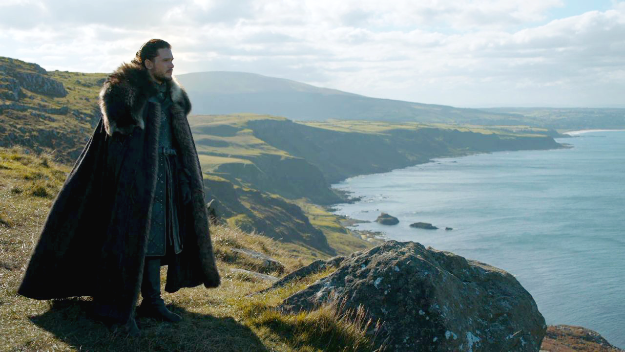
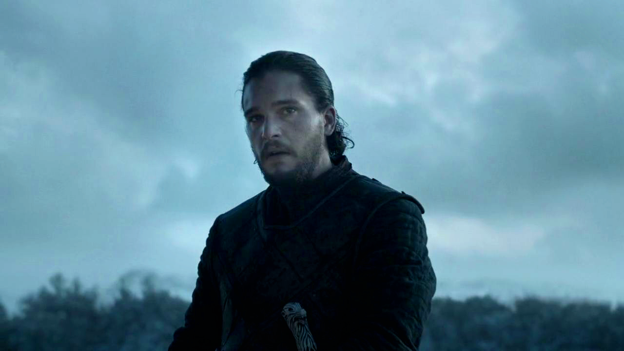
I remain - as I was with NBC's Hannibal - a steadfast fan of evocative medium shots to highlight critical character turning points and formative moments. Especially of Jon Snow, whose journey to leadership is a developmental centerpiece, and whose expression always begs sympathy of the "poor, tragic frozen baby" brand. Bonus points if the camera tracks towards the subject. 

S05E04 "Sons of the Harpy"

S05E04 "Sons of the Harpy"

S06E09 "Battle of the Bastards"

S06E09 "Battle of the Bastards"

S06E09 "Battle of the Bastards"

S06E09 "Battle of the Bastards"

S04E04 "Oathkeeper"

S04E04 "Oathkeeper"

These are similar to what I like to think of as "leader" shots - shots that frame someone close to dead center & visually sets them apart. The framing is cold, striking and lonely for some (Jon Snow), eerie and white savior-y for others (Daenerys), and sets the tone for the character of their leadership.

S06E03 "Oathbreaker"

S06E03 "Oathbreaker"

There is a fascinating visual contrast here that mirrors the differences in Jon Snow's and Daenerys Targaryen's styles of command. While Jon's backing characters are usually clearly visible as distinguishable figures, Daenerys stands out as a single pale speck in a sea of vague, depersonalized brown blobs. Given the contrast, I think there's an argument to be made re: Daenerys being a troublingly dismissive, aloof leader who establishes a cult of personality and who rises to power on the backs of people she remains willfully disengaged from, both personally and culturally. 

S03E10 "Mhysa"

S03E10 "Mhysa"

Even so, GoT doesn't aggressively ask us to reject Daenerys - in fact, she is positioned as a complex, developing ruler who, despite a tyrannical streak, still has a "good heart." GoT doesn't often tell us exactly what to think of its people or events; it drops little visual cues here and there and leaves us to form our ambivalent assessments.

In that spirit, GoT employs what I would call a "reticent" camera. Many films and shows with an element of intrigue make heavy use of dramatic irony, inviting the audience to be privy to information that the characters have yet to learn. The eye of the camera in GoT, howeversteadfastly refuses to let us "in" on alliances, deceptions, and other information that characters have not yet discovered. We generally know and see as much as the central characters do (Sansa, Jon, Arya, Daenerys, Cersei, Tyrion), and no more. (e.g., Ned Stark's beheading is treated respectfully, with a discreet cut to flying birds, and at the Red Wedding, we have no clue that a bloodbath is imminent until Catelyn discovers the man she's been conversing with is wearing protective chainmail under his clothes.) Often, characters don't even say that much to each other that is meaningful, and when they do: they lie, they lie, they lie. 

S05E01 "The Wars to Come"

S05E01 "The Wars to Come"

S05E02 "The House of Black and White"

S05E02 "The House of Black and White"

So where does the emotional honesty in GoT come from? Its reticence means the show relies frequently on cinematography in order to convey emotional information that - in a normal series - we would normally get from a character's words. Sometimes framing drops hints about characters: even before we get to know him, Tywin Lannister threateningly butchers an animal just offscreen while he and son Jamie discuss political strategy. And sometimes framing drops hints about how we should feel about a situation, or how a character is feeling in the scene.

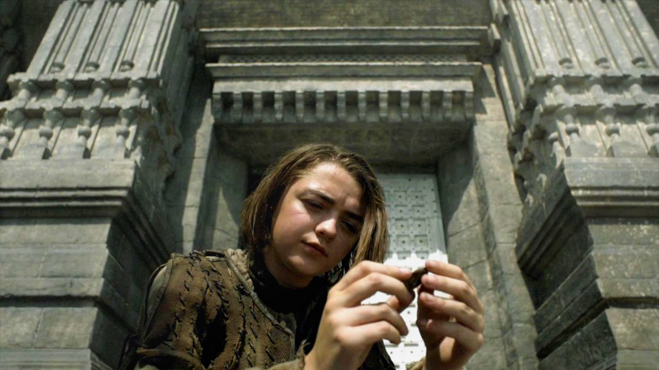
Above: we have these great upward-shot angles, which are usually visual indicators of alienation, apprehension or mystery. There are a lot of these in the show - more than we usually see on TV. Probably because everyone in this series is scared or confused (or both, if you're Sansa Stark).

We're also shown a lot of thin, vertical lines for a sense of severity, scale and dread, whether using trees or palace pillars or even bedroom curtains. Notably that dread knows no boundaries - it follows us indoors as well as out.

S05E06 "Unbowed, Unbent, Unbroken"

S05E06 "Unbowed, Unbent, Unbroken"

S01E06 "A Golden Crown"

S01E06 "A Golden Crown"

S04E06 "The Laws of Gods and Men"

S04E06 "The Laws of Gods and Men"

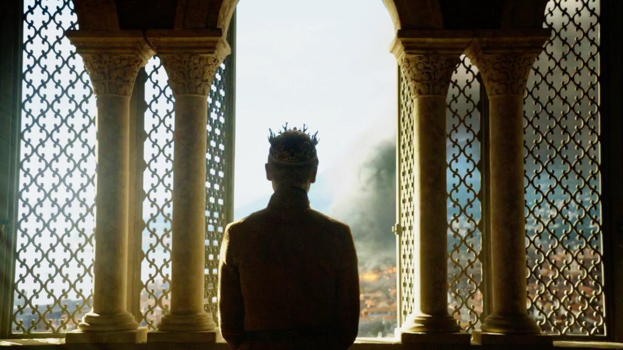
And there are windows - so many windows. GoT features many scenes of characters in dangerous, lonely situations gazing out of windows or silhouetted against them. (I'm often reminded of birds in cages.) Though these windows let in stark beams of light, it's often very hard to see what's out of them - a physical rendering of political imprisonment.

S03E04 "And Now His Watch Is Ended"

S03E04 "And Now His Watch Is Ended"

S03E06 "Kissed by Fire"

S03E06 "Kissed by Fire"

S07E01 "Dragonstone"

S07E01 "Dragonstone"

S06E10 "The Winds of Winter"

S06E10 "The Winds of Winter"

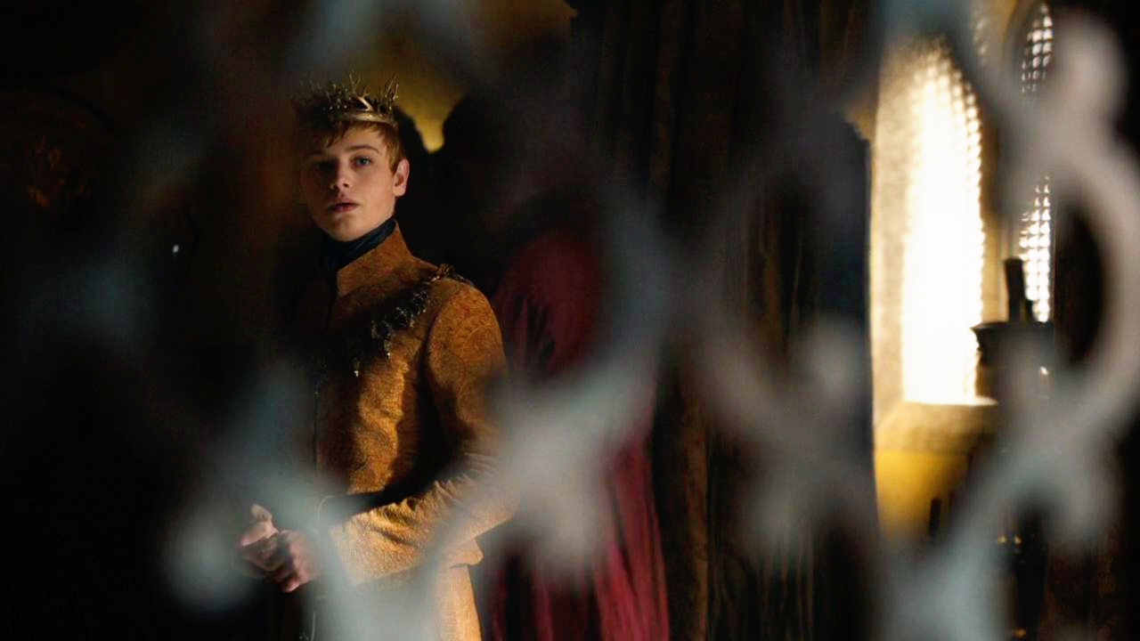
Until...Tommen Baratheon steps out of a window and out of his life entirely, into the beyond.

S06E10 "The Winds of Winter"

S06E10 "The Winds of Winter"

Outdoors, characters are no less trapped. Even in wide overhead shots, we feel the helplessness and claustrophobia of large-scale violence. Below: armies in formation surround wearied opposing forces, eventually chasing them into a forest and wiping them out. 

S05E10 "Mother's Mercy"

S05E10 "Mother's Mercy"

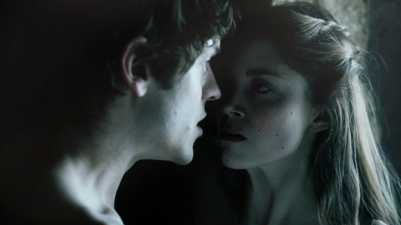
Noticeably absent are shots that invite close identification with characters, or that communicate genuine, positive intimacy, like POV shots, paired close-ups, etc. Even kissing shots and near-kiss shots are shadowy or cold-lit in a way to suggest manipulation and danger. This doesn't surprise me for a show that's wary of betrayal around every corner, and is ultimately more concerned with large-scale political relationships rather than romance or sex.

S05E04 "Sons of the Harpy"

S05E04 "Sons of the Harpy"

S05E05 "Kill the Boy"

S05E05 "Kill the Boy"

The closest we get to a sense of intimate identification with a character comes from angled,  downward shots like this one of Theon Greyjoy, which evokes a kind of brokenness and meekness. (We are literally asked to look down upon him.) InterestinglyGoT does not invite intimacy like this with characters that haven't been through some serious shit.

S06E07 "The Broken Man"

S06E07 "The Broken Man"

IMO the series is at its most hair-raising when using a Stark direwolf as a flag for magic. The wolf is CGI, of course, and though there is a jarring falseness to the way it moves onscreen, its over-smoothness has the happy side-effect of giving its scenes a sense of the uncanny. In other words, the fake wolf doesn't take us out of the experience of GoT at all - instead, it feels a little weird and magical. When it appears, we know something eerie is afoot. Maybe we're meeting a warg, or maybe Jon Snow's dead body is about to come back to life.

S03E02 "Dark Wings, Dark Words"

S03E02 "Dark Wings, Dark Words"

S06E01 "The Red Woman"

S06E01 "The Red Woman"

I've touched upon several thematic dualities - inside/outside, imprisonment/freedom, real/magical and uncanny, leading/conquering - but there are so many others in GoT. There's the struggle between old and new, north and south, east and west, and stylistic borrowings from northern Europe vs. Asia Minor and North Africa. Of the less obvious dualities, my favorite is the tension between space and clutter - most salient in the abundance of misty negative space when we are in the quiet, brutal North (below left), vs. the noise, commotion and grime of scenes associated with those from the South (below right).

S01E01 "Winter Is Coming"

S01E01 "Winter Is Coming"

S02E04 "Garden of Bones"

S02E04 "Garden of Bones"

The tension between light and dark is always interesting, and doubly so in GoT. It is not quite clear to me just yet what light and fire mean in the show, or their meanings and associations are even all that stable. Often it seems that flame signals coming danger or dark magic, e.g., lanterns leading Sansa to her Bolton wedding, or Melisandre encouraging the wielding of torches to sacrifice victims to the Lord of Light. This is an interesting subversion of the more typical light-as-clarity-and-goodness trope, and I like it.

S05E01 "The Wars to Come"

S05E01 "The Wars to Come"

S05E06 "Unbowed, Unbent, Unbroken"

S05E06 "Unbowed, Unbent, Unbroken"

S03E10 "Mhysa"

S03E10 "Mhysa"

And what about the throne? For all the bloodshed over it in this universe, we see very little of the Iron Throne, and very few characters are depicted sitting on it. GoT cinematography treats it two ways: it is either a distant, unused prop informing political tension between characters (below left), or a presence that dominates the entire backdrop, suggesting power & singular obsession (below right).

S02E01 "The North Remembers"

S02E01 "The North Remembers"

S03E07 "The Bear and the Maiden Fair"

S03E07 "The Bear and the Maiden Fair"

Finally - and this is a setup I can't quite place yet - we have this rare shot type that just about breaks the fourth wall.  

S06E10 "The Winds of Winter"

S06E10 "The Winds of Winter"

Its most striking use is late in season 6, when we cut directly from Lyanna Stark's illegitimate newborn to the face of a fully-grown Jon Snow, implying his true parentage.  There's only one other character who gets the same treatment from the camera:

S07E04 "The Spoils of War"

S07E04 "The Spoils of War"

It's (the frankly terrifying and impassive) Bran Stark, who has taken six seasons to become a magical figure capable of transporting his consciousness into other living creatures or transporting his mind's eye back in time. The parallels between these shots are almost perfect: the coloring, the zoom and framing, the lighting (note the soft orange glow against the shadowed sides of both characters' faces)...even their dress and dead-ahead stares.  

What are we being told here? Hell if I know. But I want to say it's something of a revelation shot - a signal to us that we have just been gifted an important piece of information about someone (in the case of Jon Snow), or a signal to us that a character is making use of knowledge and consciousness beyond regular bounds (in the case of Bran Stark).

I often get chills when GoT gives us shots like these. And with where the series is headed in seasons 7 and 8, I think we're gearing up for a few more powerful ones.

Comment

Comment

From the Holiday Stockpile

I have a weak spot for things. Namely, I have an inexplicable predilection for scrolling through grid after grid of meticulously curated products halfway between meaningless objet d'art and handy daily necessities with a look of rapt appreciation on my face. As such, I can be a lot of fun during the holidays.

It's not that I'm an expert gifter - no, I have spectacularly misjudged friends in the past and gifted them anything from basic Neutrogena toiletries to high end fragrances that stayed sealed in their boxes for years afterwards. 

My usefulness, instead, is in mentioning the right label to the right person and helping them look like they really know what they're doing when they shop for their Xmas lists online. Like they spend their downtime perusing hyper-modern lifestyle magazines filled with more empty space than text. Like they lurk around Brooklyn and the West Village, trying out gastropubs and tea ateliers wearing Oxfords and oversized knits. Like they have 100k Instagram followers and an apartment in Portland where they lovingly house the world's largest collection of artisan mugs. Like they've traveled a lot and have developed such specific taste that mainstream department stores just don't cut it anymore. For that, I'm here to help.

Below: 15 brands and / or retailers that are doing something so very right:


15 // Scandinavian Designs

Skrive desk $500, Spotlight table lamp $140, Klemens chair $900

Skrive desk $500, Spotlight table lamp $140, Klemens chair $900

Next time you find yourself in a posh furniture store like this one, asking, "What moron would consider a fucking $140 lamp," just know that it's me. Hi, I'm the dummy. Mind you, I would never actually shell out the cash, but I like knowing that a lamp of the perfect angularity is out there and buyable for less than an entire paycheck.


14 // Mullein & Sparrow

Facial steam $22, bath salts $29, body oil $18 

Facial steam $22, bath salts $29, body oil $18 

I'm a big believer in personal care products that are almost too pretty to use up, because they add to your living space in a subtly soothing way. I mean, bathrooms are ugly enough to begin with. 


13 // Are You Am I

Lilia top $179

Lilia top $179

Most were understandably skeptical when fashion blogger Rumi Neely debuted a line of luxury clothing, because the initial offerings were a set of perhaps poorly chosen loose tees. But in the months that followed, aggressively Californian blouses and crop tops and slip dresses were rolled out, and now I'm not convinced that Kendall Jenner shops anywhere else anymore.


12 // Poketo

Cory bifold wallet $68, journal $16, wall vessel and planter set $28

Cory bifold wallet $68, journal $16, wall vessel and planter set $28

If anything on this page is at all useful, it's probably sold by Poketo, a retailer of cute odds and ends for the home and office. They remind me vaguely of being in a toy store, surrounded by bright colors and eye-popping textures and adorable packaging.


11 / Mast Chocolate

Most flavors about $20 for 7 oz.

Most flavors about $20 for 7 oz.

This Brooklyn-based chocolatier's products are not typically stocked where one would buy food, and that just tickles me. It's like they've already admitted to themselves that chocolate is secondary, and branding comes first. That's cool. Why give out Ferrero pyramids when you can give out these babies & look super stylish by association?


10 // Larsson and Jennings

Lugano $295; Lugano $315; Saxon $1395

Lugano $295; Lugano $315; Saxon $1395

I like a timepiece that is as likely to belong to a man as it is to a woman, and Larsson and Jennings' Swiss-made watches have so few few embellishments that they fit that niche. In the watch world, these sit on the other end of the swinging pendulum from the chunky, glitzy pieces we're more used to.


09 // Hem

Key side table $175

Key side table $175

This photo by Hem is great because 1) I would never think to market tables by arranging them like War of the Worlds alien pods coming to exterminate us all, and 2) there is nothing happening here. Three lines and a disc and that's supposed to be a table. All it takes is one of these beauties to make you look like the kind of person who goes to the MoMA and knows what's going on.


08 // Sort of Coal

Hand soap $10; bincho $93; char oil cream $33; binchotan sculpture $396

Hand soap $10; bincho $93; char oil cream $33; binchotan sculpture $396

Did I read the 14-paragraph "about" page on this label's website? No. Did I need to read it to know that this oak charcoal bath product venture is mostly BS? No. But do I love the stark minimalism of their packaging and the unabashedly self-important feel of the whole thing, bordering dangerously on the absurd? Yes. 


07 // Anna Sheffield

Hazeline ceremonial stacking suite, $8300

Hazeline ceremonial stacking suite, $8300

The holiday season is engagement season, which means I know what I'll be doing: scrolling through Instagram crying inside at all the jewelry posts flying past. One profile I follow is that of New York based designer Anna Sheffield, who offers the perfect antidote to all the tired, staid styles we're too used to seeing on our grandmothers' fingers. Sheffield's signature concept is a striking burst of ray-like stones that are meant to sit atop a solitaire like a crown.


06 // Ode to Things

Cinqpoints Archiblocks $70, Kami wood cups from $70, Ancap Verona cappuccino cup $36

Cinqpoints Archiblocks $70, Kami wood cups from $70, Ancap Verona cappuccino cup $36

I'm not entirely clear on what Ode to Things really is. It's part museum, part curio cabinet, part IKEA on steroids, and part actual, functioning home goods shop. Here there be everyday objects barely recognizable as what they are, pared down and Designed within an inch of their lives.


05 // The Reformation

Aurelia top $128, Gemma dress $278

Aurelia top $128, Gemma dress $278

As label names go, I don't think there's one more striking than this. I always love telling friends about this eco-friendly clothing line: Reformation - gawd, that name. Even before you show people the plunging necklines, drapey silhouettes and 90s influence, it already sounds great. 


04 // Le Labo

Santal 26 home fragrance, $125 for 100 ml

Santal 26 home fragrance, $125 for 100 ml

By now it's inescapably clear that I like my objets pretentious to the point of humorous absurdity, and near the top of the hierarchy is the unisex fragrance line by Le Labo of NYC. They have a "manifesto." There's a section of their website titled "oddities." They sell a diffuser made from reclaimed wood & vintage style bulbs. It's fantastic. Pair responsibly with craft beer & Restoration Hardware furniture.


03 // Leibal

Lift coasters $69 for 4, Bang and Olufsen Beoplay H7 $449, marble wall clock $269

Lift coasters $69 for 4, Bang and Olufsen Beoplay H7 $449, marble wall clock $269

Like Ode to Things, Leibal is a curated collection of aesthetically pleasing odds and ends that seem to exist simply for curation's sake. Browsing the site, I'm left with a lot of questions. Who has nearly 300 bucks for a marble wall clock? And more importantly, what wall would support the sheer weight of said clock?


02 // Article Magazine

Issues range from $14 to $17

Issues range from $14 to $17

Often I have trouble finding man-gifts, but soon I may just start ordering copies of London-based Article magazine for the more sartorially-inclined men in my life. They're printed on thick paper - coffee table-worthy - and feature moody, intense photography of everything from modern art and architecture to a star du jour.  


01 // Artifact Uprising

Envelopes for $1.40 Save the Dates, wood calendar $30, soft cover photo book from $18

Envelopes for $1.40 Save the Dates, wood calendar $30, soft cover photo book from $18

And finally, nothing inspires me creatively to the point of full-blown anger like the online print shop Artifact Uprising. Neutral paper tones, crisp serif fonts, generous white spacing - this place ticks all my aesthetic boxes re: how I want my photos of the Pacific Northwest to be presented. A gorgeous, unexpected photo gift source if you ever want to distance yourself from Shutterfly and Tinyprints.

Comment